Have you ever taken a photo of a stunning flower, only to find the final image feels a bit… flat? The focus is sharp, the composition is decent, but it just doesn’t have that vibrant, captivating quality you saw with your own eyes. The secret ingredient you might be missing isn’t a new lens or a better camera; it’s a timeless principle from the world of art: color theory. Understanding how colors interact, harmonize, and create emotion is the key to transforming a simple snapshot into a breathtaking photograph.
My name is Zain Mhd. For over five years, my world has been filled with flowers. This journey didn’t start in a photography studio, but in gardens and wild meadows, simply observing and writing about the incredible diversity of plant life. I spent countless hours noticing how the deep purple of an iris seems to vibrate against the fresh green of its leaves, or how a field of yellow, orange, and red wildflowers creates a feeling of warm, buzzing energy. This deep appreciation for nature’s palette naturally led me to photography, where I learned that capturing a flower’s beauty is about more than just pointing and shooting. It’s about understanding the language of color to tell a more powerful story.
This article isn’t a rigid textbook on art history. It’s a practical guide born from years of field experience, designed to help you see the world of flowers through the lens of color. We’ll break down the essentials of color theory and show you how to apply them to create images that are not just beautiful, but also balanced, harmonious, and emotionally resonant.
The Foundation: Understanding the Color Wheel
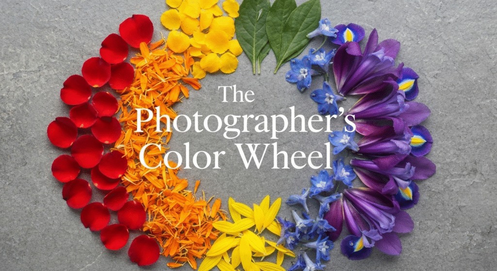
Before you can create harmony, you need to know the players. The color wheel is a visual tool that maps out the relationships between colors. For photographers, it’s like a cheat sheet for creating beautiful compositions. Trying to compose a shot without understanding these basic relationships is like trying to write a sentence without knowing the alphabet. It’s possible, but the result is often confusing and lacks impact. Let’s break it down into its core components.
Primary Colors: The Building Blocks
Primary colors are the foundation from which all other colors are mixed. They are pure and cannot be created by combining other colors. Think of them as the three main pillars holding up the entire world of color. In photography, using a strong primary color as your subject immediately grabs the viewer’s attention because our eyes are naturally drawn to these pure hues.
- Red: Evokes strong emotions like passion and energy. (e.g., Red Rose, Poppy)
- Yellow: Associated with happiness, warmth, and optimism. (e.g., Sunflower, Daffodil)
- Blue: Creates a sense of calm, stability, and serenity. (e.g., Cornflower, Delphinium)
When I first started, I would actively seek out subjects that were a single, strong primary color. A shot of a lone red poppy in a field of green is powerful because the red is so elemental and commands attention against the more complex green background.
Secondary Colors: The First Mix
When you mix any two primary colors, you get a secondary color. These colors are still bold and distinct, but they carry a bit more complexity than their parent colors. In nature, they are incredibly common and form the basis of many powerful color pairings.
- Orange (Red + Yellow): A blend of red’s energy and yellow’s cheerfulness.
- Green (Yellow + Blue): The color of life, nature, and tranquility.
- Purple (Blue + Red): Often associated with royalty, mystery, and creativity.
Green, in particular, is the photographer’s constant companion in the garden. It serves as the perfect canvas for almost any other flower color, a concept we’ll explore more later.
Tertiary Colors: The Nuances
Tertiary colors are the subtle, in-between shades you get by mixing a primary color with a neighboring secondary color. This is where the true richness of nature’s palette shines through. These are the colors that add sophistication and depth to your images, like amber, magenta, or teal. Recognizing these subtle variations allows you to create more refined and unique compositions.
Here is a simple breakdown of the color hierarchy:
| Color Type | Definition | Examples in Flowers |
| Primary | The three foundational colors that cannot be mixed. | Red Tulip, Yellow Sunflower, Blue Hydrangea |
| Secondary | Created by mixing two primary colors. | Orange Marigold, Green Leaves, Purple Iris |
| Tertiary | Created by mixing a primary and a secondary color. | Red-Orange Zinnia, Blue-Violet Crocus, Yellow-Green Euphorbia |
Key Color Harmonies for Flower Photography
Now that you know the colors, let’s talk about how to use them together. A color harmony is a combination of colors that is pleasing to the eye. Using these established principles helps you create compositions that feel intentional and balanced, rather than chaotic and accidental.
Complementary Colors: Creating Maximum Impact
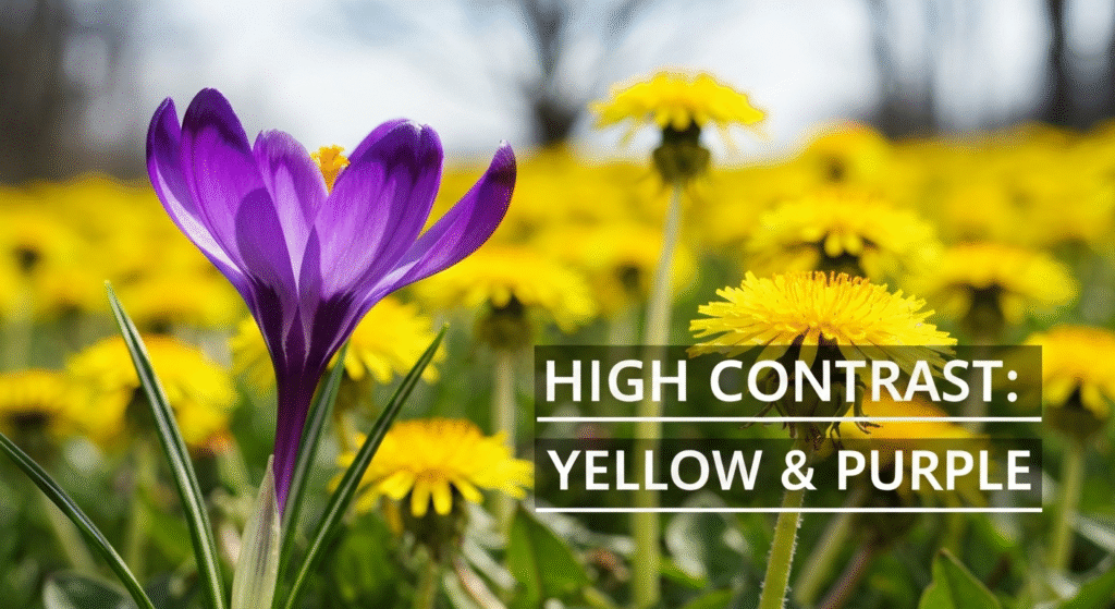
Complementary colors are opposites on the color wheel—think red and green, blue and orange, or yellow and purple. This pairing creates the highest possible contrast, making both colors appear more vibrant and intense. When you want your subject to pop off the screen, this is the harmony to use. It’s bold, energetic, and demands attention.
From my own experience, this is one of the most effective and readily available harmonies in any garden. I once spent an afternoon trying to capture a perfect shot of a lavender plant. The photos were nice, but they lacked energy. Then, I noticed a small patch of yellow buttercups growing nearby. By changing my angle to frame the purple lavender with the yellow flowers in the background, the entire image came to life. The purple looked deeper, the yellow brighter, and the photo had a dynamic tension it was missing before.
Common Complementary Pairings for Photographers:
- Red & Green: The classic example. A red rose or tulip against its green leaves is a perfect illustration.
- Yellow & Purple: Think of a purple crocus in a lawn dotted with yellow dandelions. The contrast is electric.
- Blue & Orange: This can be trickier to find in a single plant, but you can create it by composing a shot of blue forget-me-nots against a background of fallen autumn leaves or orange gazanias.
Analogous Colors: The Soothing and Serene Palette
Analogous colors sit next to each other on the color wheel, such as blue, blue-green, and green. This scheme creates a serene and comfortable feeling. Because the colors are so similar, the transitions between them are smooth and gentle, resulting in a unified and harmonious image. This approach is perfect for creating peaceful, meditative photos that focus on texture and light rather than dramatic contrast.
This harmony is excellent for capturing clusters of flowers or filling your frame with a single plant that has multiple shades. A close-up of a bougainvillea branch, with its range of pink, magenta, and red bracts, is a beautiful example. There are no jarring transitions, allowing the viewer’s eye to move peacefully through the frame.
How to Use Analogous Colors:
- Focus on a single plant: Many flowers, like roses or zinnias, bloom in a variety of related shades. Isolate a group of them.
- Look for color gradients: Find a scene with a range of similar colors, such as a garden bed with yellow daffodils, light-orange tulips, and golden-yellow primroses.
- Use it for a calming effect: This palette is naturally relaxing, making it ideal for creating soft, artistic images.
Monochromatic Colors: The Power of a Single Hue
A monochromatic color scheme uses only one color but explores its different tones, shades, and tints (by adding black, white, or gray). This might sound boring, but it’s actually one of the most powerful ways to create a sophisticated and impactful image. By stripping away the distraction of other colors, you force the viewer to focus on other elements like shape, texture, form, and the play of light and shadow.
My favorite subject for this is a white flower, like a lily or a gardenia. A white flower is never just “white.” In the morning light, it has soft gray shadows that define its petals. In the shade, it might take on a hint of blue from the sky. Capturing these subtle shifts in tone within a single color can produce an incredibly elegant and dramatic photograph.
| Harmony Type | Description | Effect in Photography |
| Complementary | Colors opposite on the wheel. | High contrast, vibrant, energetic. Makes the subject pop. |
| Analogous | Colors adjacent on the wheel. | Low contrast, serene, harmonious. Creates a unified look. |
| Monochromatic | Variations of a single color. | No color contrast. Emphasizes texture, shape, and light. |
Beyond the Wheel: Temperature, Saturation, and Light
A great photographer knows that color isn’t just about hue. Other properties of color, like temperature and saturation, play a massive role in the mood and quality of your image. Understanding these will give you another layer of creative control.
Color Temperature: Warm vs. Cool Colors
Colors are often described as having a “temperature.” This doesn’t refer to the physical temperature but to the emotion they convey.
- Warm Colors: These are the reds, oranges, and yellows. They are associated with the sun and fire and tend to feel energetic, cheerful, and inviting. In a composition, warm colors often feel like they are advancing toward the viewer.
- Cool Colors: These are the blues, greens, and purples. They are associated with water and sky and tend to feel calm, peaceful, and sometimes melancholic. Cool colors appear to recede in an image, which can create a sense of depth.
I consciously use this when shooting. If I want to create a photo that feels full of life and joy, I’ll fill the frame with warm-colored flowers like zinnias or sunflowers. If I want a more contemplative, peaceful image, I’ll focus on a field of blue lavender or a cluster of purple irises against a soft green background. You can even mix them by having a warm-colored subject against a cool-colored background to create both separation and emotional complexity.
Saturation and Vibrancy: Controlling the Intensity
Saturation refers to the intensity or purity of a color. A highly saturated color is rich and bold, while a desaturated color is more muted and subtle. The level of saturation in your photo has a huge impact on its mood.
- High Saturation: Creates a sense of energy, excitement, and vibrancy. It can sometimes look unnatural if overdone.
- Low Saturation: Creates a softer, more gentle, and often more atmospheric or vintage feel.
The weather is your primary saturation control in the field. Bright, direct sunlight will naturally produce highly saturated colors. In contrast, an overcast day diffuses the light, which softens and slightly desaturates colors, making it perfect for capturing pastel shades without harsh reflections. You can, of course, fine-tune this later in editing software, but getting it right in-camera is always the best starting point.
The Role of Light: Your Ultimate Color Tool
Light is what makes color visible, and the quality of that light dramatically changes how colors are rendered in your photograph.
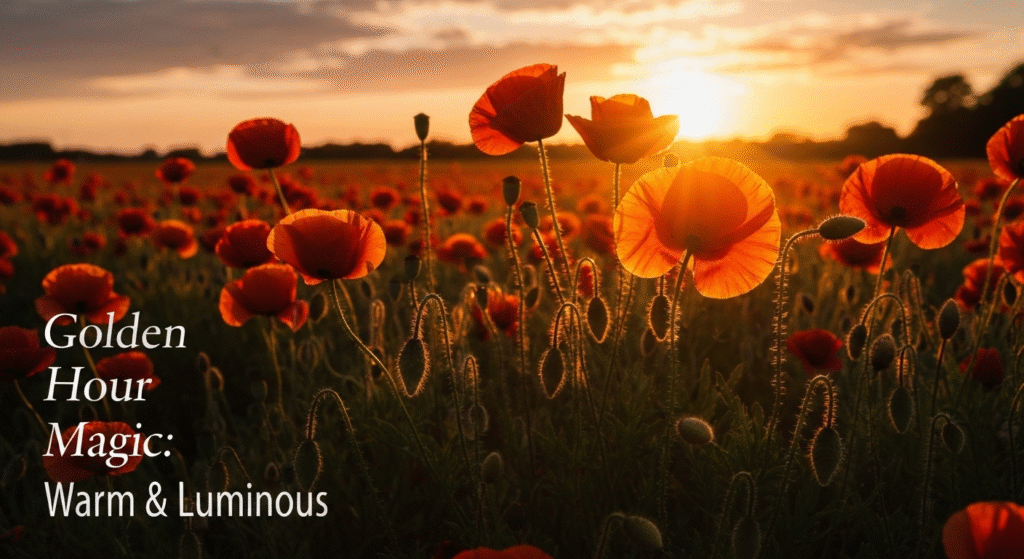
- Golden Hour (first hour after sunrise, last hour before sunset): The light is soft, warm, and directional. This golden hue beautifully enhances warm colors and adds a magical glow to the entire scene. It’s almost impossible to take a bad photo in this light.
- Midday Sun (Harsh Light): The overhead sun creates strong highlights and deep shadows. This high contrast can wash out delicate colors and is generally the most challenging light for flower photography.
- Overcast Skies (Soft Light): Don’t be discouraged by a cloudy day! An overcast sky acts as a giant diffuser, creating soft, even light. This lighting condition is fantastic for flower photography because it minimizes harsh shadows and allows the true colors of the flowers to shine through with gentle saturation. It’s my go-to for capturing delicate details.
For a deeper dive into the science of color perception and theory, the Adobe Color wheel resource is an excellent interactive tool for exploring these harmonies.
Frequently Asked Questions (FAQs)
What are the easiest color harmonies for a beginner to use?
For beginners, the easiest and most effective harmonies are complementary and analogous. Complementary (like a red flower on a green background) is easy to spot and instantly creates a powerful, vibrant image. Analogous (like a group of pink and red flowers) is also simple to find and guarantees a pleasing, harmonious result.
How much does the background color really matter?
The background is just as important as your subject. A busy, distracting background with too many competing colors will pull attention away from the flower. A simple, unified background—like green foliage, a clear blue sky, or a dark shadow—will make your subject the hero of the image. Always check your background before you take the shot.
Should I edit the colors in my photos?
Post-processing is a powerful tool, but it should be used to enhance, not fabricate. The goal is to bring the digital image closer to what you saw in person. You can use it to slightly boost saturation, adjust the white balance to correct the color temperature, or darken the background to make your subject stand out. Avoid pushing the sliders so far that the colors look unnatural.
Can I effectively mix warm and cool colors in one photograph?
Absolutely! Mixing warm and cool colors is a fantastic way to create visual interest and depth. A common technique is to have a warm-colored subject (like an orange poppy) against a cool-colored background (like the blue-green foliage of other plants). The warm color will advance, and the cool color will recede, creating a natural-looking 3D effect.
Conclusion
Color theory is not a set of restrictive rules but a creative toolkit. It gives you the language and the framework to make intentional decisions about your compositions, transforming your photography from reactive to proactive. By understanding the relationships between colors on the wheel, you can start to see the hidden harmonies all around you in nature. You’ll learn to appreciate the soft beauty of an analogous palette and the dramatic energy of a complementary one.
The next time you’re out with your camera, don’t just look for a pretty flower. Look for color stories. See how the yellow of a dandelion pops against the purple of a thistle. Notice the thousand different shades of green that make up a simple background. Combine this knowledge with an awareness of light, and you will unlock a new level of artistry in your work. The world is your canvas, and color is your paint.